Description: PNG image
|
| From: | Noeck |
| Subject: | Re: Persian accidentals (koron and sori) |
| Date: | Mon, 6 Dec 2021 16:29:30 +0100 |
| User-agent: | Mozilla/5.0 (X11; Linux x86_64; rv:78.0) Gecko/20100101 Thunderbird/78.14.0 |
Dear Werner,
I am all for it and know nothing about Persian music.
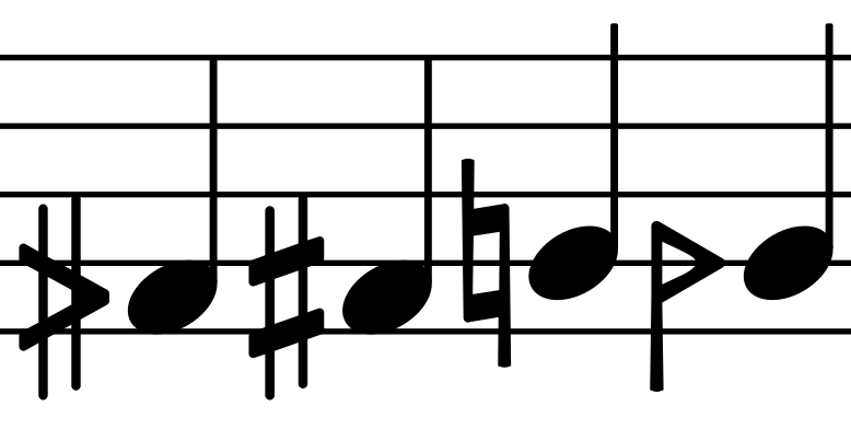
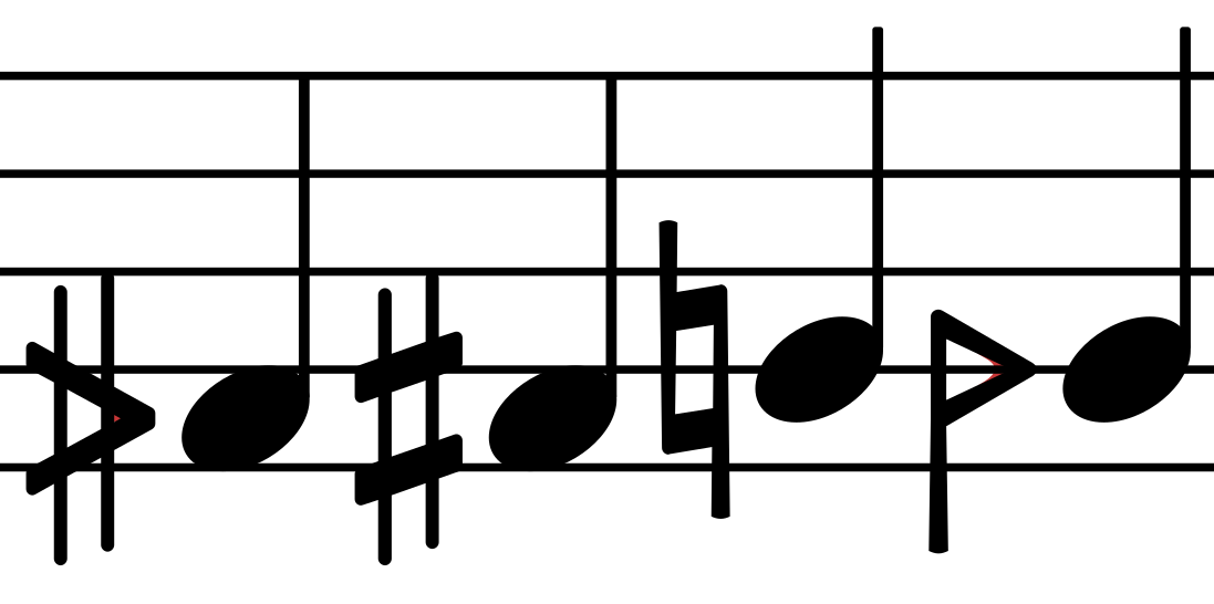
One comment: When looking at Fig. 11 in your PDF, two suggestions
came to my mind. The handwritten accidentials show some less sharp
edges because the ink is flowing in the inner angles of the glyph.
As you already take the liberty to match the style of classical
accidentials, how about avoiding some sharp inner angles by
1. filling the tiny white triangle in the sharp-like glyph (I am less convinced)
2. making the right inner angle round (looks good to me)
I have two images attached where the additinal ink is painted in red and in black.
Of course, this is just a suggestion.
Joram
I know, thanks.  Here you can find some glyph examples

  https://corp.unicode.org/~roozbeh/sori-koron.pdf


    Werner
![]() Bildschirmfoto von 2021-12-06 16-23-23.png
Bildschirmfoto von 2021-12-06 16-23-23.png
Description: PNG image
![]() Bildschirmfoto von 2021-12-06 16-22-17.png
Bildschirmfoto von 2021-12-06 16-22-17.png
Description: PNG image
| [Prev in Thread] | Current Thread | [Next in Thread] |