[Date Prev][Date Next][Thread Prev][Thread Next][Date Index][Thread Index]
Re: Mission statement and Knuth-Plass reconsidered
|
From: |
John Gardner |
|
Subject: |
Re: Mission statement and Knuth-Plass reconsidered |
|
Date: |
Wed, 24 May 2023 08:49:05 +1000 |
Hi Branden,
I've tried a couple of times to start reading this, but the font is so
> fantastically ugly that it's making my brain wander off.
>
The embedded typeface (both in the original PDF and Deri's version) are
encoded in Type 1 format. Given the constraints of that particular font
format, it wouldn't surprise me if the conversion from TeX's font-format
(whatever the hell it is) was a crude one. Type 1 font files are also
limited to 255 characters, so robust character sets need to be stored in
multiple separate "fonts" (which would explain the hideous kerning of
"Žena" and "Můj").
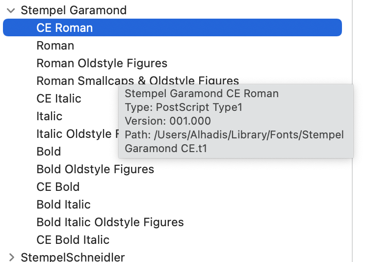
I have an ancient archive of commercial fonts all saved in Type 1 format,
and when installed, the styles list looks like this:
[image: Screen Shot 2023-05-24 at 8.47.02 am.png]
(But at least I didn't pay tens of thousands of dollars for them, lol…)
— J
On Wed, 24 May 2023 at 05:16, G. Branden Robinson <
g.branden.robinson@gmail.com> wrote:
> At 2023-05-07T14:22:14+0100, Deri wrote:
> > On Sunday, 7 May 2023 03:57:57 BST G. Branden Robinson wrote:
> > > Myself, I wonder if K-P couldn't be implemented above the formatter
> > > itself, using a diversion. We could then put the implementation in
> > > an auxiliary macro package. Since I have plans to attack our
> > > facilities for diversion re-processing anyway, it might be a good
> > > time to identify any feature gaps we have that would make doing K-P
> > > this way more difficult than it needs to be.
>
> I'll note that even if K-P can't be done this way, because the algorithm
> requires a view of more than one page at a time (I, uh, admit I haven't
> actually learned how Knuth-Plass works yet), then the foregoing might
> still be worth doing for widow and orphan management.
>
> > If you are interested in micro typography there was an interesting
> > discussion some years ago, not K-P:-
> >
> > https://lists.gnu.org/archive/html/groff/2002-02/msg00001.html
> >
> > The thesis to which they are referring can found here:-
> >
> > https://www.tug.org/TUGboat/Articles/tb21-4/tb69thanh.pdf
> >
> > It seems good to me.
>
> I've tried a couple of times to start reading this, but the font is
> so fantastically ugly that it's making my brain wander off.
>
> Screenshot attached.
>
> Does the PDF not embed the font it's expecting? What is causing the
> insane variation in x-height here? Or is this actually magnificent
> typography and I'm too much of a Philistine to appreciate it?
>
> Regards,
> Branden
>