[Date Prev][Date Next][Thread Prev][Thread Next][Date Index][Thread Index]
accent glyphs too large?
|
From: |
Werner LEMBERG |
|
Subject: |
accent glyphs too large? |
|
Date: |
Fri, 07 Aug 2020 17:37:53 +0200 (CEST) |
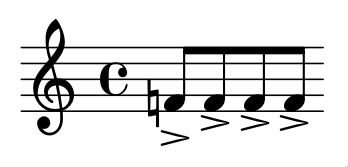
Compare this:

  { f'!8[-> f'-> f'-> f'->] }

with this:

  dashLarger = \tweak font-size #-1.2 \accent

  { f'!8[-> f'-> f'-> f'->] }

I consider the output of the second case much better – I don't like
the vertical offset of the accent if a natural is present.

What edition was the model for the large horizontal size of the accent
glyph?

Maybe we should change the default...


    Werner

- accent glyphs too large?,
Werner LEMBERG <=