[Date Prev][Date Next][Thread Prev][Thread Next][Date Index][Thread Index]
bar problem
|
From: |
febty febriani |
|
Subject: |
bar problem |
|
Date: |
Wed, 27 Oct 2010 20:43:37 +0900 |
Hi everyone,
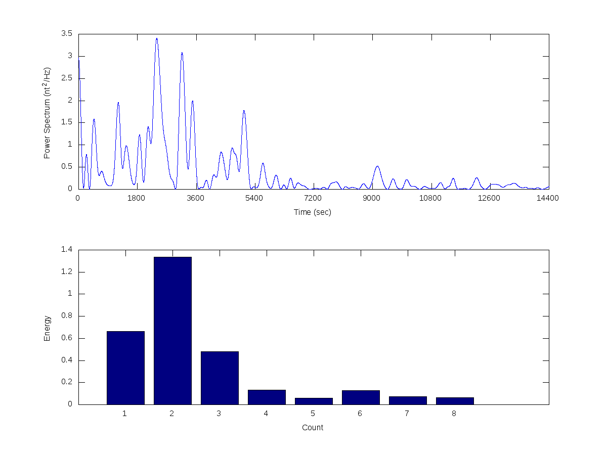
I want to plot a bar from my data. Actually, I succeed to make a bar from my data. I attached it. My problem is: is it possible to put the first bar (marked by 1) between 0-1800, the second bar (marked by 2) between 1800-3600 until the last bar (marked by 8) between 12600-14400 so that the second graph [the graph of energy vs count] of my figure looks more proportional with the first graph [the graph of Power Spectrum vs Time]?
Any help is greatly appreciated.
Thanks,
Febty
 histogram-20080901.hx.41.png
Description: PNG image
- bar problem,
febty febriani <=